This post is for anybody who had ever been frustrated by Windows 7 automatically changing the language you're typing in to Chinese. It's great that they have the ability to switch the input language on the fly, however, I'm confident that any user testing would have revealed that for most people, it's just really, really annoying for most people, most of the time. Anyway, read on to find the fix:
The Scenario
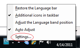
You're minding your own business, typing an email to a friend or typing a Word document and all of a sudden, your characters are appearing in Chinese though you swear you didn't do anything. You look down to the bottom right corner of your desktop and you see this:
Look at the left-most icon (called the Language Bar): it says "CH" indicating that you're now in Chinese. Clicking on the CH allows you to switch back to English. Great. Now you can get back to typing your email.
"Dear Jonathan, I just wanted to say 昨嘗馳" ! CRAP. You think to yourself, "Okay, I'll just switch it back now that I know how." at which point you click the CH, change it back to EN, and continue on your merry way with your document, just slightly more pissed off than you were 5 minutes ago. ***
"Dear Jonathan, I just wanted to say that I really appreciated you explaining how to fix my shi獨角"... At this point, your internal dialogue is screaming: "NO! NO NO NO! I HATE WINDOWS, I DIDN'T DO ANYTHING AND I DON'T WANT TO WRITE IN FRIGGIN' CHINESE."Relax. You take a deep breath, and fix it again. However, never again: we're having an intervention. We're going to fix this problem once and for all.
The fix
The little known magic that's going on here is that you're pressing a special, mystical key sequence that changes the input language. By default, it's set to Left Alt + Shift. Pretty large oversight Windows. Clunky fingers are constantly hitting those buttons together, sending elderly people everywhere into a blind rage. Well, no more. Let's fix it.
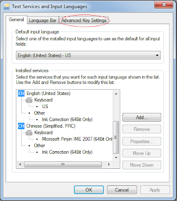
1) Right click on the CH (or EN if you're on English) on the Language bar and select "Settings..."
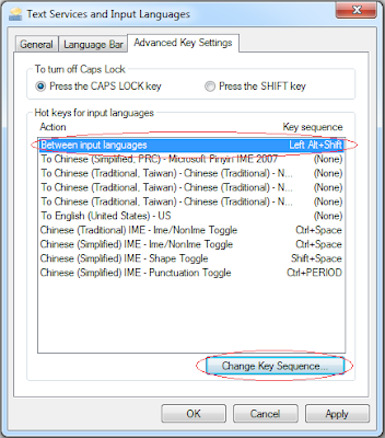
2) Click on the "Advanced Key Settings" tab
3) Notice that the first line "Between input languages" is set to the Key Sequence "Left Alt + Shift". Select that line and click the "Change Key Sequence" button.
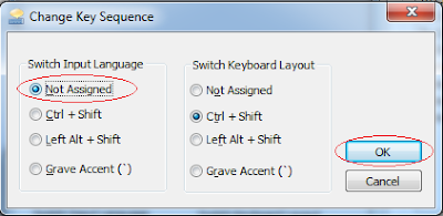
4) Change the "Switch Input Language" option to "Not Assigned" and press OK.
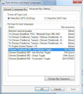
5) Highlight any other line that has a Key Sequence associated with it:
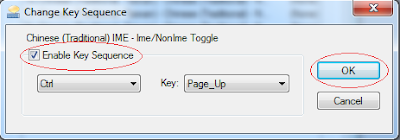
6) Uncheck the "Enable Key Sequence" checkbox (shown below as checked -- uncheck it!) and press OK.
7) Repeat steps 5-6 until there are no more Key Sequences associated with Actions.
8) Press OK until all of the popups are gone. TADA! No more mysterious switching of your input language!
---
"Dear Jonathan, I just wanted to say that I really appreciated you explaining how to fix my shiny new Windows 7 input language." Ahhhh, peace, at long last.
Thursday, April 14, 2011
Saturday, November 28, 2009
The Usability of Blogs
So what makes a blog usable? Well, that depends on what the purpose of the blog is, however, I am going to enumerate some ideas that I have about making a blog very user-friendly and enjoyable to read. I have specifically left out the content of the blog, as I've discussed it in detail here, and am focusing on the design aspects of a blog. There are many resources available when it comes to helping you design your blog. After reading them, and deciding that most of the people writing these things haven't read many blogs, and perhaps have never written one, I have come up with my own list of what how to make a usable blog based on my own blog reading and blog writing experience.
#1) Keep it simple.
This is my primary rule when making any interface: make it as simple as possible without comprimising the robustness of the application (or in this case, the blog). How is this possible? Aren't complexity and robustness directly related to one another? How can you make a simple interface while having a lot of features? Well, it's a shock to most people, but it's definitely possible. It involves a good organization of your content, and putting the most important features in the face of the user. For a blog, the most important thing is the content, so you want to have it front and center, not hidden away behind banner ads and a thousand useless gadgets. Keep the clutter to a minimum. The last thing I want to do is cognitively overload the readers of my blog. This is a huge turn-off and a great way to ensure that people will not read your blog.
#2) Make finding content easy.
People want to search, and they want to be able to get to your previous posts easily. There are three built-in gadgets for Blogger that allow you to do this: a search bar (powered by Google), labels, and the ability to show your archived posts.
The search bar is the most important thing on any website, and a blog is not exception. It should be at the top of the page, or in the case of a blog at the top of the side-bar that is used for navigation, and should always visible when a user first lands on the page.
Labels are a fantastic way to organize content. They're akin to "folders" in an operating system, but you can apply as many of them as you want to each entry to specify in a word what the entry is about. That way, if you want to find all the content in a blog about "inventions", you can search for the label "inventions" or click on the "inventions" label in the Labels section of the navigation pane.
Finally, you should allow your users to view your archived posts. Showing your archived posts allows users to quickly examine the content of your blog based on the titles you give to each post. Showing your archived posts also allows users to see how actively you blog, and perform a manual course-grained search of your content. Unlike a site search where a user wants to find information about something specific, users that find your writing interesting may want to see what else you've written about. They can do this quickly by viewing your archived post titles. Which brings me to my next point: Label your posts appropriately. Make sure that you provide enough information in the title of a post to allow a user to know what they can expect if they read the post.
#3) Make it familiar.
Familiarity. How comforting. People read blogs, and some people read a lot of blogs. Don't try and be different just to be different. It's okay to have a familar look and feel if you . Notice that this blog uses one of the default blogger templates: that's not because I'm lazy, but because it's well laid out. A lot of blogs use this template. I'm not trying to differentiate myself by putting up a fancy template with a lot of graphics. Quite the opposite actually: I use my content to seperate myself, while using a familiar template that users are comfortable with and know how to use.
#4) Use the sidebar well.
The sidebar is one of the most powerful tools you have as a blogger. On a site like Blogger, there is a temptation to just add gadget after gadget after gadget because they're all (well, not all) so shiny and nifty. But please, control thyself! As a general rule, I put a maximum of 6 gadgets on the sidebar, and each one has a purpose. The order that I display the gadgets is also intentional: from the most important at the top, to the least important at the bottom.
As I wrote above, 3 of the gadgets are directly related to finding content on my blog.
Another useful gadget is one that allows users to sign up for an RSS feed of your content. This allows your readers "pull" updates as your push them onto your blog, instead of requiring that they constantly check your blog for updates. Making them come to your blog to see if there's new content decreases the chances that they read your blog, especially if they come a number of times and don't find anything new.
I also like to provide a list of links on the sidebar. The links are always related to the content of my blog, and provide a reader with supplimental reading. It's just a nice little service I like to offer to my readers.
Finally, I like to have something interactive. Blogger allows you to add a "poll" for your users to fill out. This is a great little feature that keeps the users engaged in the blog and encourages them to read through your blog's content (if the questions in the poll are crafted carefully).
#5) Have a good blog header.
A good header includes a good blog title. Make sure that your blog title describes what a user can expect to find in your blog. Give an idea of what the majority of the writing will be related to.
Notice that I put a nice graphic up behind my title to engage my users as soon as they land on the blog. This little bit of eye candy is my "item of flair", but doesn't take away from the primary purpose of the blog: conveying interesting information. It gives the blog some personality. It's important to note that it's a small picture, and therefore doesn't cause the page to load slowly.
I'd love to hear your comments on this list; and if you think I've missed anything that's really crucial. For me, what it comes down to as a blog reader and blog writer, is that there are two things that will kill your readership: first and foremost is bad content, and secondly is poor organization and layout. You can overcome and will be forgiven for some bad design by providing really interesting content, but you will not keep readers if you have fantastically boring content and a sleek and usable design.
Engaging your readers
I have some experience writing a blog, and I have always strived to make it as engaging and readable as possible. My primary weapon of choice is humour. People like to laugh. I like to make people laugh. I figure it's a good fit. Use what the good Lord gave you, right? I may have a receding hairline, but at least I find it funny. Sometimes. I have received a number of comments about how engaging my writing is, and for me, this is a compliment of the highest order. The comments are always about either (a) how interesting the adventures are that I've written about or (b) how funny the entries are. Well, that's fantastic, because that's exactly what I was going for. And now I'll share with you (aside from humour) how I do it:
#1) Content is king.
This is the supreme rule. Actually, all other rules are sub-rules of this rule, and explain how to make your content king. But you must remember, without great content, people will just move on to the next thing. There is no such thing as web loyalty. Those days, are long gone.
#2) Be yourself - show your style.
People are either going to like your writing style or they're not, it's that simple. The style that I use while writing is heavily dependent on the content of the entry.
Generally, my style employs a lot of humour and I try and use as much punctuation and italic text as possible to help people read entries the way that I hear them in my head when I write them. I apply this principle to all of my entries, regardless of the content, and the demographic that I'm writing to (for the most part).
#3) Tailor your writing style to the content of an entry.
If I'm writing a factual entry, for example, explaining how to solve a technical problem or describing how to do something, I will use a lot of examples. I find that when learning a new concept, it's far easier for people to relate to it when they can draw comparisons to things that they already know.
If I'm writing an opinion piece, I will generally use a more creative and persuasive writing style, primarily written in the active voice. This helps the entry appear confident and like I know what I'm talking about (whether or not this is true). I try to limit the hard facts and quotations to a minimum while still conveying the primary pieces of information that I need to in an interesting and fun way. I figure that if somebody wanted to read an enyclopedic entry on the topic, they would go to Wikipedia.
#4) Interesting pictures.
When I'm writing about life or adventure, I spend a lot of time sorting through the pictures and carefully selecting the ones that I want to display to the readers. These are not always just the "best" shots that I've taken (although, admittedly, I will try and build a story around them to show them off from time-to-time), but ones that I can use to convey a funny or meaningful story. They say that a picture is worth a thousand words, but I try and make the writing compelling enough that the picture gives a feeling to augment the thousand words around it. I have found that funny captions beneath the pictures can go a long way in adding to the value of an entry.
#5) Break up your content.
People get bored easily, especially in the age of blogging. In the so-called (useless) information age, there are two overwhelming attitudes that provail: entertain-me-now and I-don't-have-time-for-this. If you don't engage your readers immediately, they will scan through the content (unless they're there for a specific purpose, like they're your mother trying to keep tabs, or a friend that is prepping for the dreaded 'did you read my blog?' question) and if they don't find what they're looking for in a matter of seconds, they're on to the next blog.
Also, avoid walls of text. Embedding pictures and video are good ways to do this. But the easiest way to do this is to organize your thoughts logically and use whitespace liberally. A blank line between paragraphs goes a long, long way.
Finally, using enumerated or bulleted lists can make a huge difference. Enumerated lists are obviously useful if you're trying to show a linear sequence of steps, or convey an ordering of the content. Bulleted lists are a fantastic way of conveying a lot of information very quickly without overloading the reader with information. They're generally
#6) Encourage user feedback.
People like to feel important. People like to give opinions. Allow them to do so! Let users leave comments, and provide ways for them to feel like their opinions are valuable like having a sample poll in your navigation sidebar. These are great and simple ways to engage your readers.
Hopefully this blog entry has helped you think about your writing style, and you'll be able to take something useful away from it and apply it to your blog. I'd love to hear some feedback on my ideas and opions.
Saturday, November 14, 2009
Inventions: Wash it up!
Yes, it's certain: instead of doing what you did while broken down on the side of the highway, you should have emailed your wife, or texted her, or called her. But we all make mistakes. When I was growing up, there was a poem by S.H. Payer that hung in the entrance hall bathroom, and it had some wonderful words of wisdom that I want to share with you:
When you are faced with decisions, make that decision as wisely as possible - then forget it. The moment of absolute certainty never arrives.
Payer must not have been married. If he was married, he would've know that you're not allowed to forget it. You must repent. And then re-repent. And then do something really, really nice to make up for it. Like doing the laundry.
Now, let's step back for a second. It was definitely a nice gesture, no doubt. But let's face it, if the laundry wasn't already done and dried, would you have done it? Or would you have maybe tried to settle up by doing the hand dishes, or taking out the trash? These tasks, thought not wholly enjoyable, are far less time consuming than the pain-staking process that is handwashing clothes. When I was in Asia and again when I was riding my bike across Canada and traveling through Central America, I had the *ahem* "pleasure" of washing my clothes by hand on occasion. And these were only my clothes, and even then, in a limited space capacity! I can't imagine if I were washing for a whole family. This joyous task would often take hours of my time, if not more. It was only then that I truly came to appreciate the automatic washing machine.
(Front-loading washer)
Yes, that's right, the washing machine.
"But how can you put this in the top 5 inventions of the last century?" you might think to yourself. The answer is simple: it saves me time... and lots of it. And as far as I have been able to tell in the time I've spend on my current stop on this planet, time is the most valuable resource that I have, and the only one that truly matters. If time ends, well, so do I. But I digress...
Washing my clothes is a weekly/bi-weekly/monthly (depending on my current supply of underwear) duty that I have yet to figure out how to bypass. Thankfully, due to the fact that the washing machine reduces the time I spend washing my clothes to almost nothing, I don't mind this task so much. In fact, most of the time I just pop in the laundry and go surf the WWW.
The first patent for a washing machine was granted in England in 1691, but it wasn't until 1904 when the first electric washing machine resembling today's machines became available. And of course, like all good things of utility, they sold like hotcakes. By 1930, there were almost a million sales of washing machines.
(Who wouldn't want one? It's a happy day!)
There are two reasons that the washing machine was and continues to be such a popular item:
#1) Utility
This is undeniably the number one reason why people use washing machines -- they are incredibly useful and have a huge return on the investment in terms of time. Even with the most poorly designed washing machine, the amount of time that it takes you to figure out how to use it will be miniscule in comparison with the time you save by using it.
#2) Usabililty
Thankfully, most washing machines are incredibly simple devices. Select the size of your load, the temperature of the water for washing and rinsing, and turn it on. I would frankly be surprised if a monkey couldn't run a washing machine given enough time and washing detergent. How exactly to do this varies from machine to machine, but as I said before, the main purpose of a machine is utility, and I have yet to see a washing machine that is so badly designed that it's completely unusable. And if you can't figure it out, you can always look online for instructions.
Well, the laundry's in the machine... time to surf.
Friday, November 13, 2009
Inventions: WWW-owzers!
So, having your car break down on the way home wasn't such a bad thing. At least you got to pay all your bills, read the business section of the Times and Post, setup a sell on one of your stocks based on a feeling you got from an article in the Times (which turned out to save you thousands), check the score of the Knicks game, manage your fantasy hockey pool, reply to your boss' fuming emails and provide some balm to the work wounds, look at pictures of the vacation spot you're inevitably going to have to take your wife to for missing dinner once again, buy tickets to the sympony to show your family-values and how you realize the importance of culturing your children, check out a few new bands, and twit that you were broken down on the side of the highway (which actually prompted your buddy Chuck to come and help you out of your jam).
Now, if you were stuck in the 80's, you might be thinking "uh huh, right, and what were you driving, a Delorean?" I feel ya man, I 'discovered' Coldplay after they won a bunch of grammy's. But no, really, this can actually happen now. It's not magic. It's the WWW. WWWell, I guess it's kinda magic. But not like black magic that kills dingos in their sleep or anything. It's magic because it has transformed the entire world, and opened up a whole new universe of possibilities.
So, why the WWW? Shouldn't I be writing about the internet? Or better yet, the modern computer? Why not the transistor and other gizmos required to make computers? Or the gadgets required to make the gizmos that make computers? Or the cell phone that you used to do all that? Or the...
Enough already. Yes, they're all very formidable inventions, and any one of them could have easily made the list of the top 5. But they didn't. The WWW did. Why? Because of the simplicity of the idea and the fact that although the other devices are all required to make the WWW happen, the WWW is the most powerful communication medium in human history and enables the development of such a wide variety of useful applications.
In March of 1989, while working at CERN in Geneva, the English physicist Sir Tim Berners-Lee proposed the WWW: "a system of interlinked hypertext documents contained on the Internet. " By Christmas of 1990, Berners-Lee had built all the necessary tools to have a working Web, including the first web server, the first web browser, and the first web pages (which explained how to use the web). Not surprisingly, Berners-Lee is now the Director of the the World Wide Web Consortium (W3C), which is the main international standards organization for the WWW. In August 1991, he posted about his World Wide Web project on a newsgroup (alt.hypertext), which is considered the debut of the Web as a public Internet service.
What Berners-Lee did singlehandedly is postitively mind-numbing. Did I mention that en route to creating an invention that has singlehandedly changed the way the world operates, he also invented a few other things you may have heard of? For example, he needed to create a language for people to use the Web in (HTML), a protocol for the information exchange (HTTP) and a way for people to access that information (URLs). It's... incredible. As my sister says, "I hope he patented it."
By 1993, the Internet was catching on -- but really, it was the WWW that was enabling this.
In everyday conversation, people use the words "web" and "internet" interchangeably, however in reality, they're very different. The Web runs on top of the Internet. The Internet is a system of interconnected computer networks, and the Web is one of the many servies that runs on it. The Web today is composed of a tremendous number of interlinked web pages that can be viewed with a web browser, and can contain all sorts of multimedia: text, images, videos, audio clips, etc. but it is not the Internet. For example, calling the Web the Internet is like calling Windows* a computer -- Windows enables us to use a computer more easily (arguably) and we can build applications that run on Windows, but the computer still exists without it and can be used through other means.
So if you're not convinced that the web should be on this list, ask yourself how you got to this web page. Ask yourself how you found the last 10 things you were looking to find out. Ask yourself how many hours a day you spend using the Internet, and how many of them are spent using a web browser. Quickly you'll see why this is in my list of the top 5 inventions that have enhanced livability.
-------------------------
* kill me now Computer Gods, for naming Windows instead of saying generically "an operating system" or "Linux"; it's simply because everybody** that uses a computer knows what Windows is, but the same cannot be said about an operating system, or Linux
** okay, maybe not everybody
Inventions: Heat it up!
Other than a cold beer on a hot day, there's nothing quite like a hot meal on a cold day. Picture this: you've been at work all day. Your boss has given you a hard time. You missed a deadline. It's cold, and your car broke down on the way home. Your kids are already asleep when you arrive home because you're not there until 10 pm, and your wife is upset because obviously your job is more important than your family, and you missed the dinner she'd spent hours preparing. There's a note on the table telling you that it's in the fridge.
Well great, that's just great. Beau-ti-freakin'-ful.
Now really, there are only two things that could make this worse. The first is if the food was left on the counter collecting bacteria and you ate it and got food poisoning; but thankfully there's a brilliant appliance that stopped that from happening. The second is if you, cold to the bone and depressed, had to eat this delicious meal... cold. I shudder just thinking about it.
Enter: the microwave. You pull out the plate your wonderful wife prepared for you and pop it into the micro, and two minutes later you're eating a warm, life-rejuvenating plateful of love and pasta. Thank you microwaves! Thank you for uniformly exciting the water and other polarized molecules in my food, and providing me with an evenly warmed meal! With this warm belly-full of fuel providing you with a newfound zest for life, you march upstairs and really show your wife your appreciation. You fold all the laundry, match the socks properly, and put it all away.
Okay okay, this scene is perhaps a little dramatic. But dramatizations are used all the time to get the point across. The microwave is a time-saver, and in my opinion is one of the greatest inventions of the 20th century.
(just in case the other 10 are in use...)
Sure, I could have preheat the oven for 15 minutes and then spent another 20 minutes waiting for my food to get warm. Or I could've put it in a pan and heated it on the stovetop. But these things would have taken valuable minutes and I may not have had the energy left to fold the laundry. Not to mention what a massive waste of energy it would've been to waste all of that heat to warm only a single dish!
Like many good inventions, the microwave was invented accidently. In 1945, while working on making radar devices for Raytheon, Percy Spencer noticed that the chocolate bar in his pocket started to melt. He then used the device to pop popcorn, and then to cook an egg (which exploded in the face of one of the experimenters). From there, he build a metal box which he shot the microwaves into, and when he placed food in it he found the temperature of the food rose rapidly. After this, Raytheon got a patent, and created both commercial and home-use microwaves, which were copied by many other companies, and the devices sold like hot-cakes (*groan*).
As is the case with many technologies, the microwave has suffered from a serious degredation of usability in many cases. 20 years ago, the microwave interface was very simple: put your food inside, set the time, and start the microwave. Now, although there are still a number of simple and usable interfaces, there are an alarming number of microwaves that come with 100 page manuals and require a rocket science degree to get working. Buttons for everything from reheating a 3 pound plate of leftovers to boiling water exist on the surfaces. These don't really improve the usability of the microwave: in fact, often the additional complexity just frustrates users. I'm hopeful that in time we will see the microwave interface return to it's original simplicity. After all, the point is to save us time.
Inventions: Lighting it up!
Can you imagine coming home after nightfall and having to light all the candles, or fumble around to light the kerosene lamps just so that you could have enough ambient light to perform your routine activities? Just imagine coming home after a long day only to have to cook in a dimly lit home, or the tremendous eye strain you'd incur from reading in an insufficiently lit area.
Electric home lighting is so engrained in our lives that we can hardly imagine that just 100 years ago, it was not commonplace. Flicking on the light, except for the exceptionally wealthy, didn't exist. It's commonly believed that the lightbulb was invented in 1879 simultaneously by Thomas Edison in America, and Josesph Swan in England. However, there were actually 22 other inventors of incandescent lightbulbs before then. For a variety of reasons, Edison's bulb (shown on the left) was the one that caught on and proliferated. I say "Edison's lightbulb", but really the everyday lightbulb was based on a design by a Toronto medical electrician Henry Woodward and his associate Matthew Evans. They patented the lightbulb but didn't have the financing to commercially produce it, and ended up selling it to Edison, which he used to light up his bankroll.
So if this happened in the 1880s, how can I claim this is an invention of the 20th century? Simple. It wasn't until 1904 that the first tungsten filiment was used in an incandescent bulb, and not until 1910 when William David Coolidge invented an improved method of creating tungsten filiments that the modern-day incandescent lightbulb came into existence. Incandescent lightbulbs are great because they're so cheap and widely available, but the major problem is that there is that they produce more heat than light, which is a tremendous waste of energy. Other types of light bulbs, such as halogen, fluorescent, and LEDs have been invented, all of which are much more energy efficient than incandescents.
Home lighting is an area where technology can help reduce the effects of human ignorance. Lighting accounts for a large portion of world-wide energy consumption. With more efficient lighting technologies such as LEDs and CFLs (compact fluorescents), the amount of energy used to light our indoors is being reduced even as the number lights increases. Another big improvement is in the way light are controlled. The light control trend is moving toward motion sensing, where lights are automatically turned on and off as people enter and exit rooms. This will inevitably save a tonne of energy as lights being left on when they are not in use is a waste of energy.
Electric home lighting has allowed us to extend the length of our day and be more productive. Because of this simple fact, it is one of the most important inventions that has enhanced livability.
Subscribe to:
Posts (Atom)